As we have seen in our introduction, historical pricing inquiries (HPI) can be pulled from reliable data sources like Yahoo Finance and The Wall Street Journal. We’re going to go ahead and pull this data for IMAX from WSJ.
https://quotes.wsj.com/IMAX/historical-prices
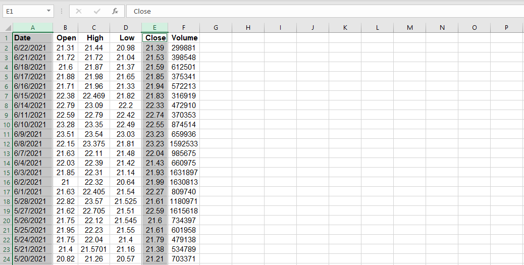
The data is download into a flat .csv file. The file is then converted to an .xlsx file, and the worksheet is renamed to “HPI.”
Let’s go ahead and select column A and column E simultaneously by holding down the ctrl button if you’re using Windows (or “cmd” button if you’re using a MAC).
Now, let’s do the following:
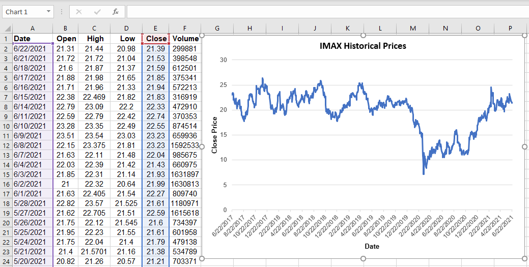
- graph date vs. close price
- examine different ways we can arrange this data (Pivot Table)
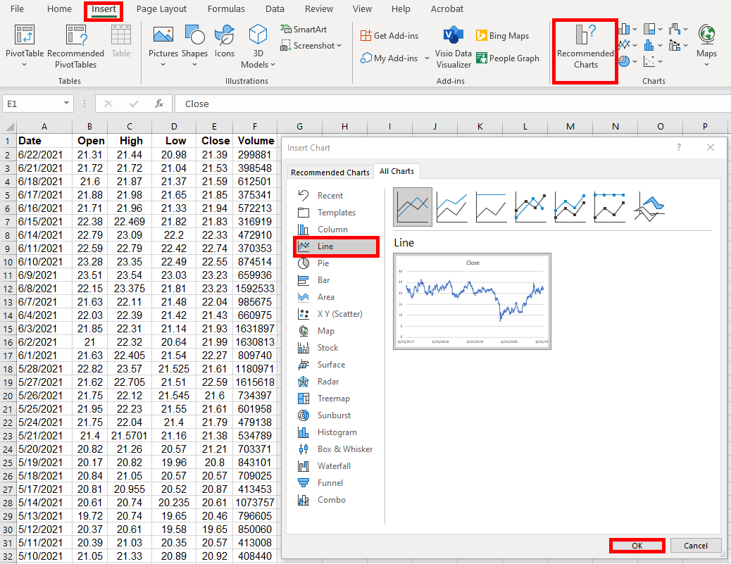
- Click Insert
- Click on Recommended Charts
- Click on “All Charts” tab in the pop-up dialog box and select the “Line” graph on the left-hand side; click “OK.”
The following graph is created; when clicking inside the graph, columns A and E are auto selected to represent that the data is pulled from those two columns.
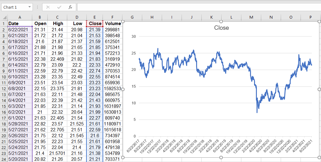
Now, let’s rename the graph to “IMAX Historical Prices”, and add the x-axis, and y-axis titles.
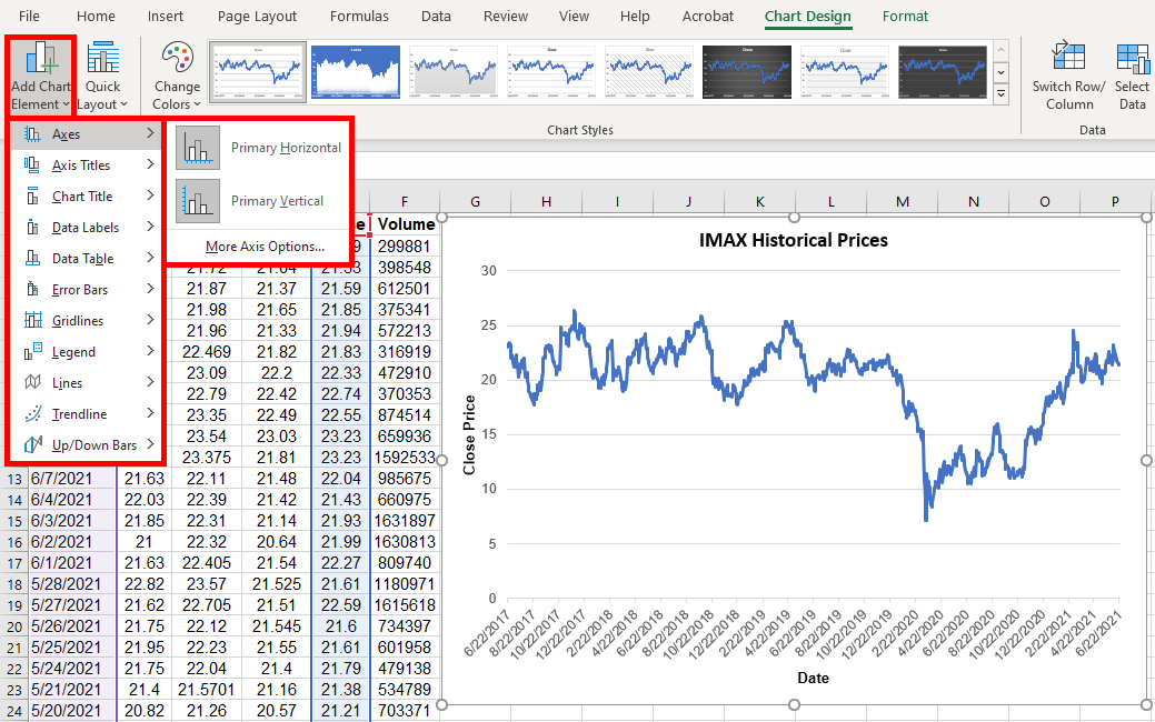
- To add the axis labels, click on the graph, go to the design tab on the menu above, and select the “Add Chart Element” drop-down menu.
- From there, you will further select “Axis Titles,” and add “Primary Horizontal,” and “Primary Vertical” axes.
Below are the steps for selecting axis titles:
- Click on “Add Chart Element.”
- Click on “Axis Titles.”
- Select “Primary Horizontal”
- Select “Primary Vertical.”
Now that we’ve explored the graphical aspects of Historical Prices, let’s take a look at how we can reorganize this data into a Pivot Table. This feature is built into Excel and is easy to implement. The basic steps are outlined below:
- Click on “Insert” tab in excel.
- Select range of data.
- Select Pivot Table.
- The resulting dialog box pops open.
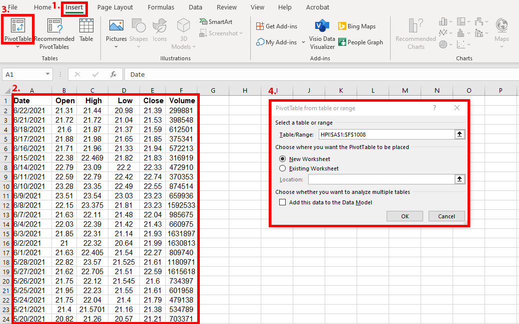
As you can see from the dialog box above, the Table/Range is set to $A$1:$F$1008 , which is exactly the range of data we need. As such, we want to ensure to capture the entire range of data so that the resulting pivot table does not omit anything of value. For our purposes, we want the PivotTable report to be placed in a New Worksheet (so we select the “New Worksheet” radio button), but we can also put the data in our existing worksheet.
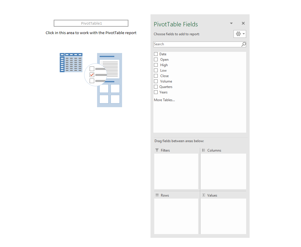
The resulting Pivot Table appears blank because we have not yet set the parameters, otherwise known as “Pivot Table Fields.” Please also note that this Pivot Table was inserted into a new Worksheet auto-labeled as “Sheet1.” We may choose to rename it later on. This will not affect the Pivot Table data.
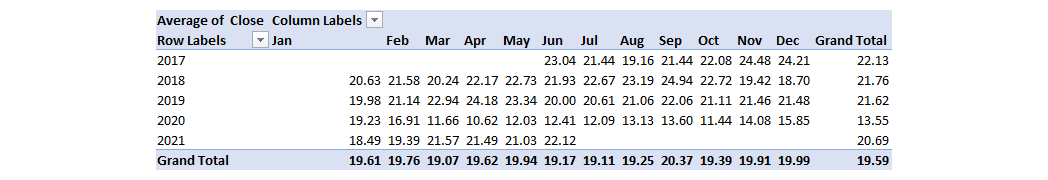
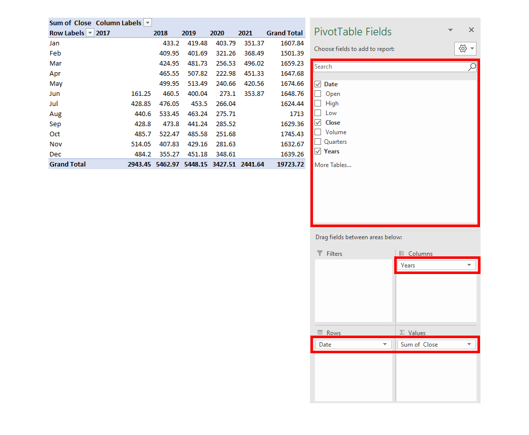
Suppose we want to summarize the HPI close price data by month and year as opposed to the standardized day to day variable dataset we have extracted from the Wall Street Journal. We will thus select our fields accordingly.
- Let’s put a check mark next to “Date.” Notice how Quarters and Years are auto selected, because they are all tied in.
- We will uncheck quarters because we don’t want to see the quarterly data.
- Let’s now go ahead and put a check mark next to “Close” since close price is a variable that is of interest to us.
- Let’s also ensure that “Years” are checked.
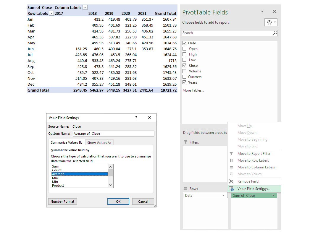
The data is now arranged precisely how we want it – with closing prices organized by months. Though, there is one problem; the pivot table automatically summed the data as opposed to giving us the average close price for the month and year. This is an easy fix. We will adjust it manually.
- Let’s do a drop down on “Sum of Close” in the “Values” area and select “Value Field Settings.”
- Then proceed to change the calculation from “Sum” to “Average.”
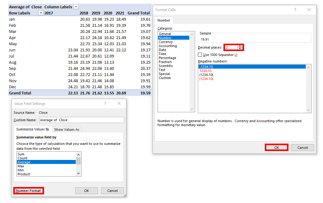
- The resulting pivot table now looks like this, with average values as opposed to summed values.
- A simple rounding of decimal points (down to 2 decimals) gives us a better-looking data set.
We can also switch data between different Pivot Table fields. For instance, we now have “Years” in columns and “Date” in Rows.
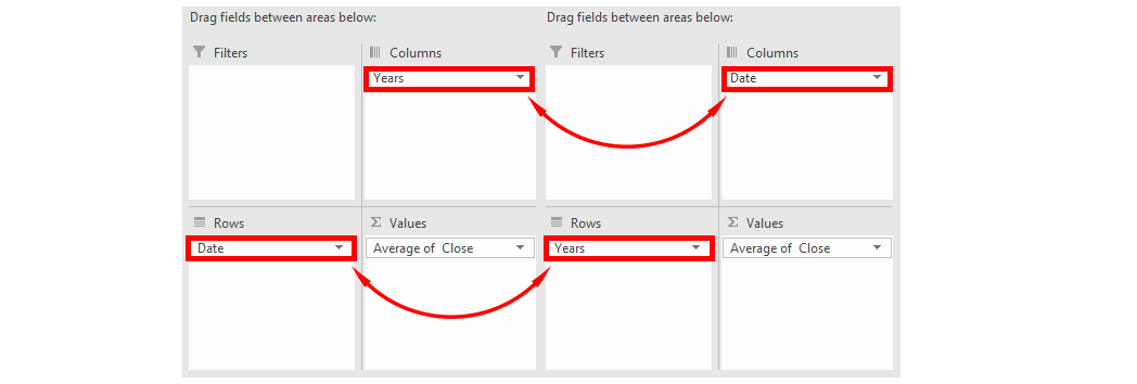
The resulting Pivot Table now looks like this: